Downview Prison
The brief was tough but intriguing; an uplifting but not too optimistic mural, in one of the most hostile areas of a women’s prison. The project that unfolded was unexpected, and unpredictable.
Through our ongoing collaboration with prison arts charity Clean Break, we were introduced to Downview Prison as a potential LSOM project location early in the year. We were offered a wall in one of the most intense areas of the prison, the segregation unit. The wall in question borders the outdoor exercise area, for women who have been isolated away from the rest of the prison. Intense.

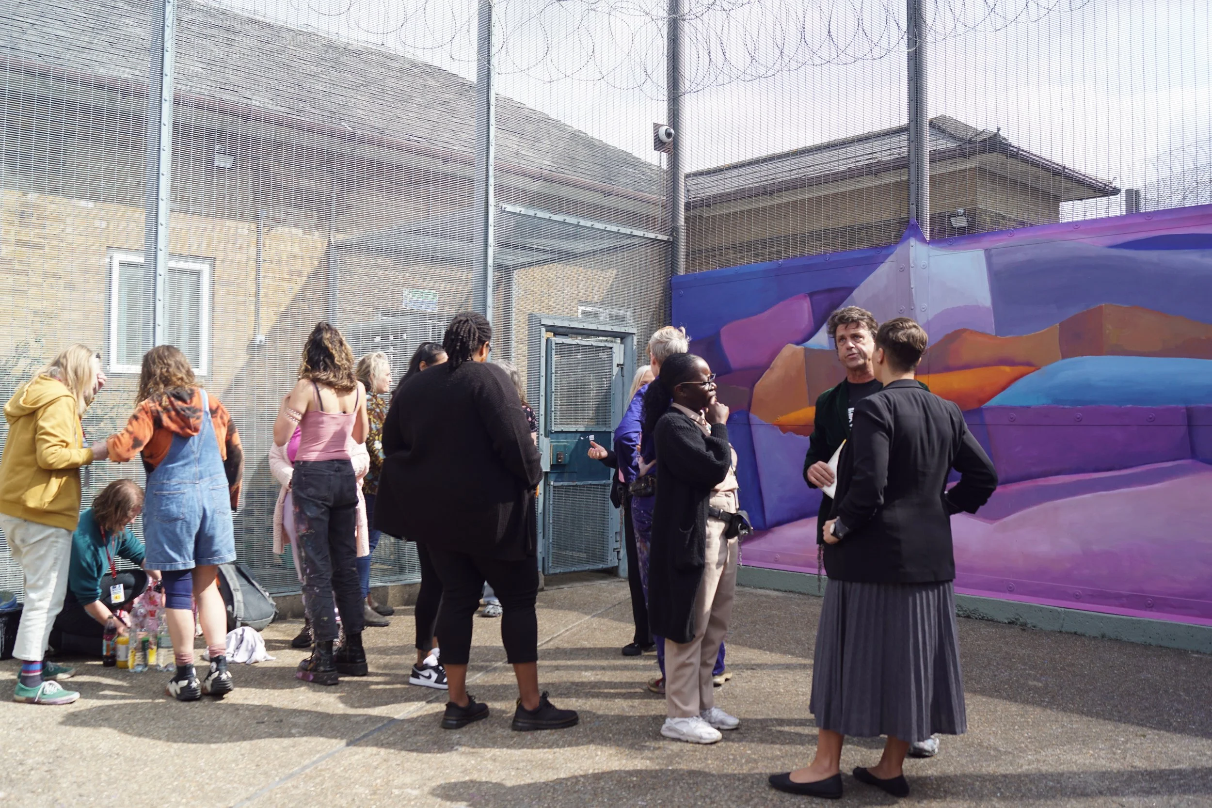
Logistically, every part of the project was challenging. A mountain of bureaucracy had to be summited before any of our artists could even step foot into the building. There was a long vetting process for each participant and strict rules on what items could be brought into the prison area. We were not allowed to bring in any electronic devices or even a watch. To know the time, we had to ask passing staff.
Most of the team were not sure what to expect within the prison itself. Each woman living there had their own unique story and outlook to share. Obviously, the environment itself was not welcoming. Huge grey walls, steel fencing and many many gates.
We were able to involve nine prison residents in our mural design process. It felt hugely important to offer these women some level of influence over a space they unfortunately do not have a choice to be in. This project is an opportunity to change how their physical environment looks and feels.
The feelings attached to the space were understandably complex. Our design would have to respond sensitively to the heaviness of the project canvas; very literally an unwanted wall in their lives.
In our workshops together, we discussed the major do’s and don’ts that the women wanted from this art work.

Everyone agreed that there should be no “toxic positivity”. In other words, zero unrealistic optimism in the form of cheesy slogans or cliche symbols that would further emphasise the discomfort of their current situation.
Hope is necessary, but it needs to be tethered to reality.
We put together a manifesto of what we want this mural to do:
soften / offer space / stimulate / nurture
and not do:
no entrapping / no stereotypes / no patronising cliches
After three design workshops together, we had two emerging ideas to present to the prison governor.
Idea one was an immediate veto. An optical illusion ‘cut-out’ on the wall, imagining what possibilities could lie within and outside of the physical space. This was too suggestive of escapism.
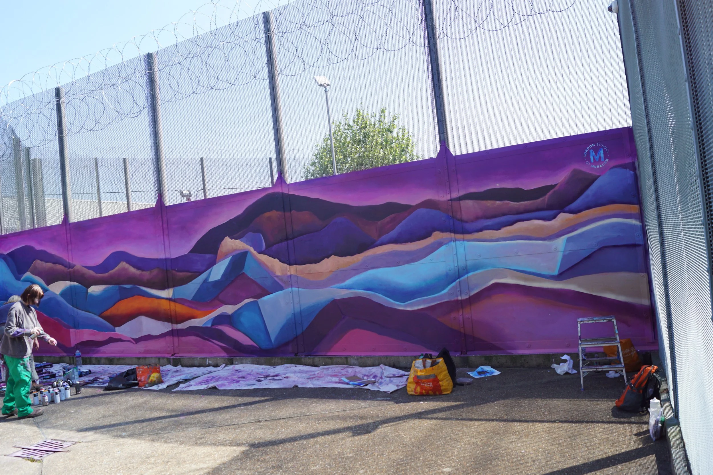
The second idea was much more palatable; an abstract design exploring layering and horizons.
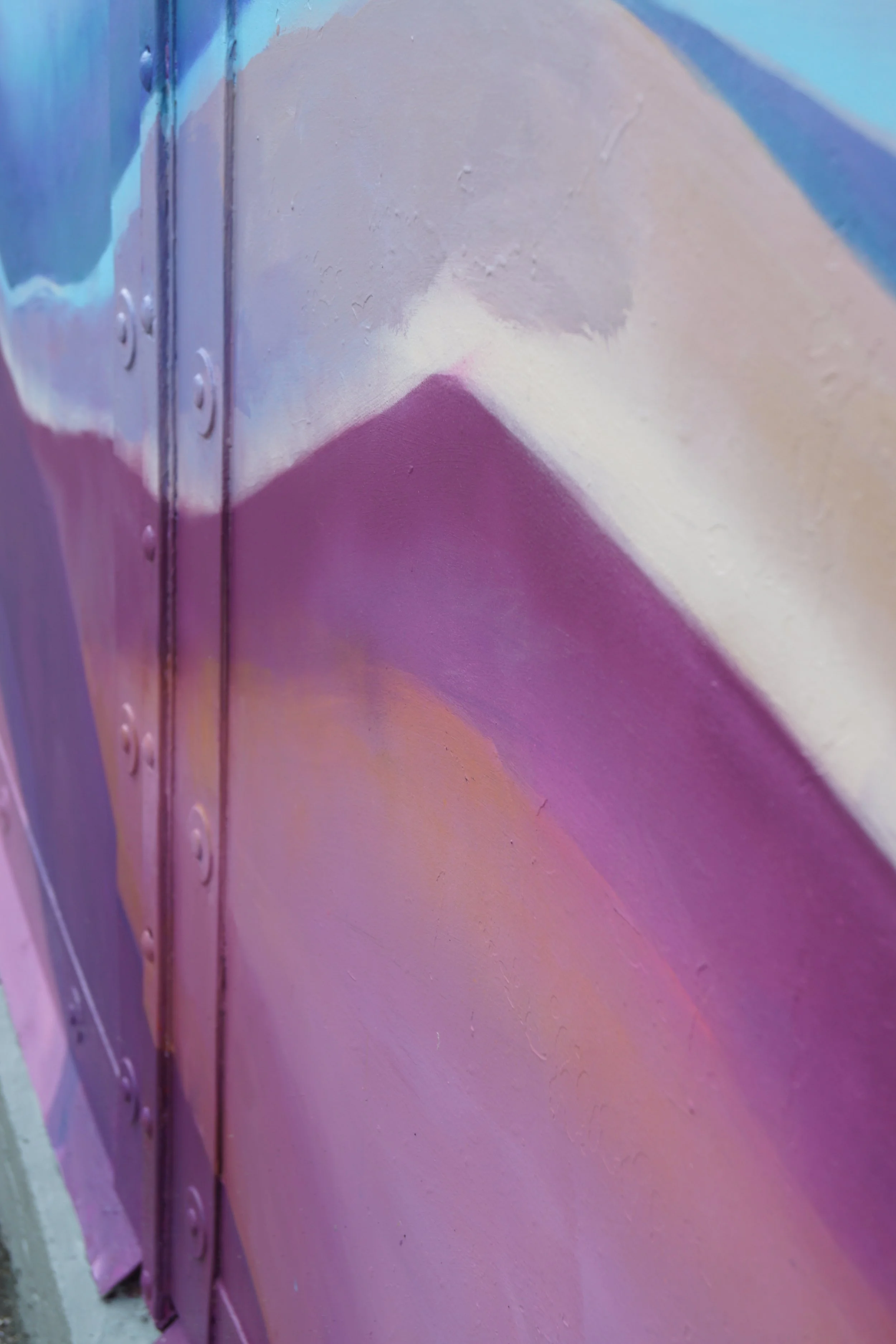
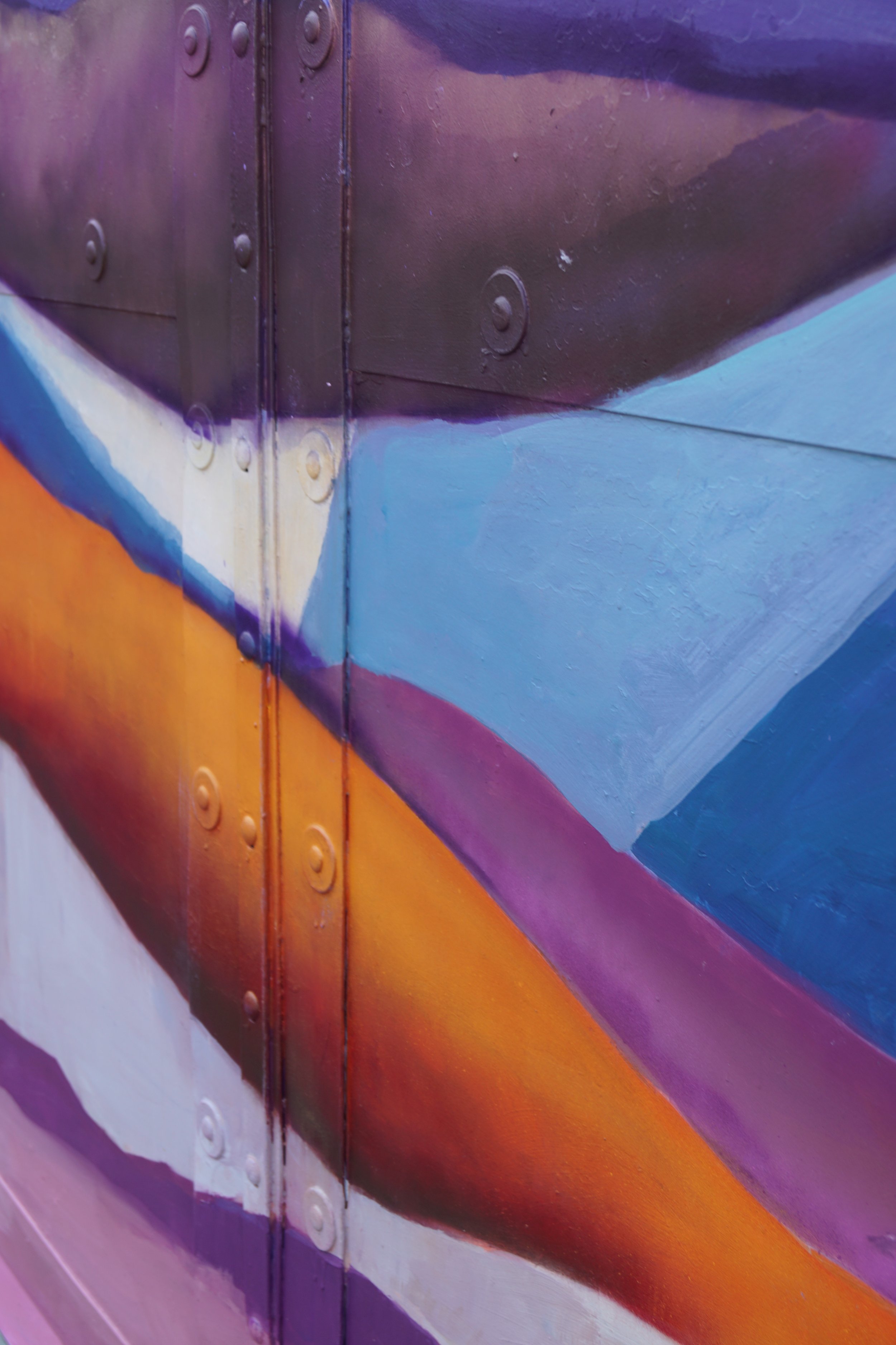
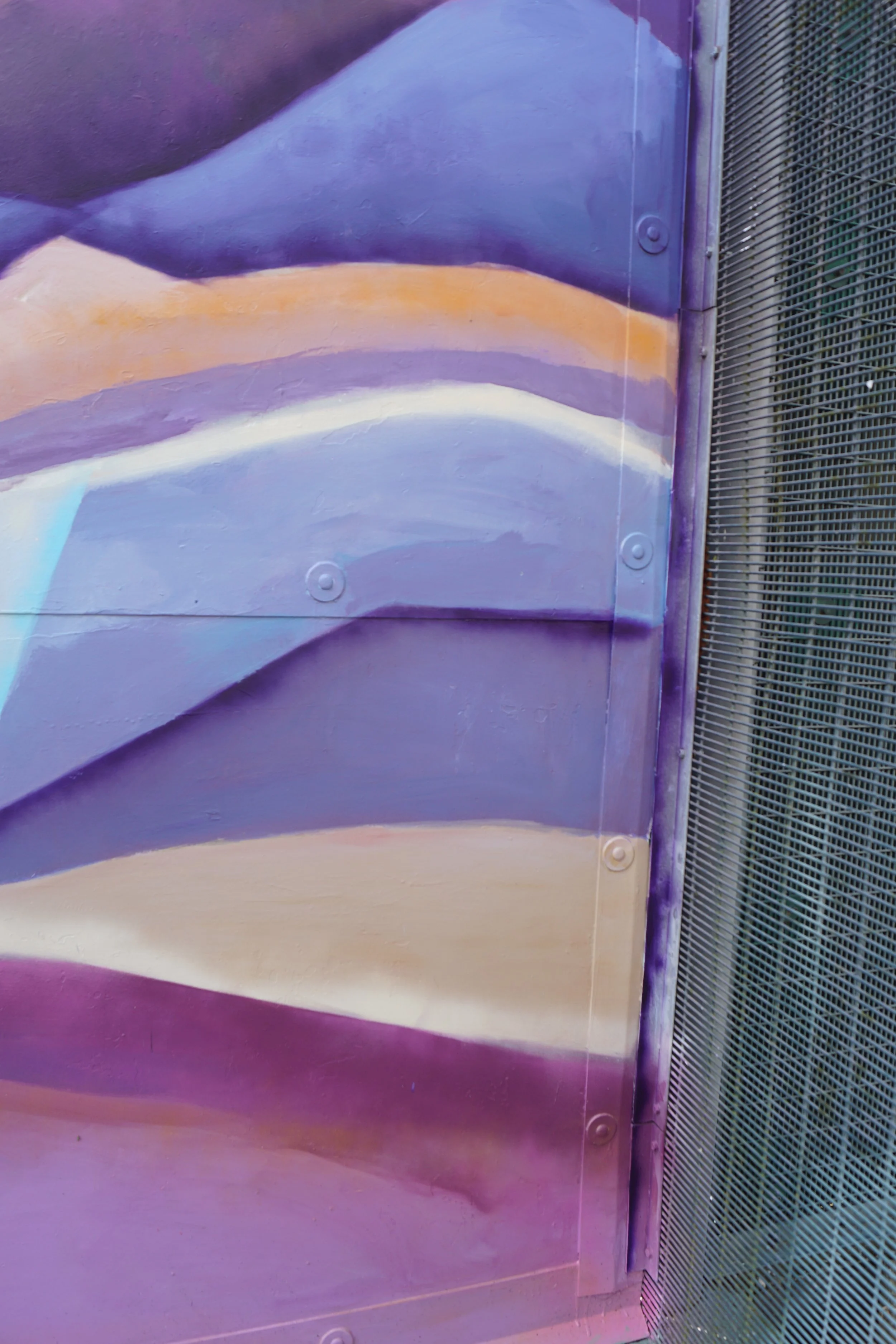
Inspired by the geometric zigzagging of torn sheets of paper, layered shapes could also be read as a physical landscape.
We were intentional about not making this landscape too figurative or real. It isn’t meant to be an actual mountain range, more like a theatre-set suggestion of one. This ambiguity leaves space for each viewer to see the layers in their own way.

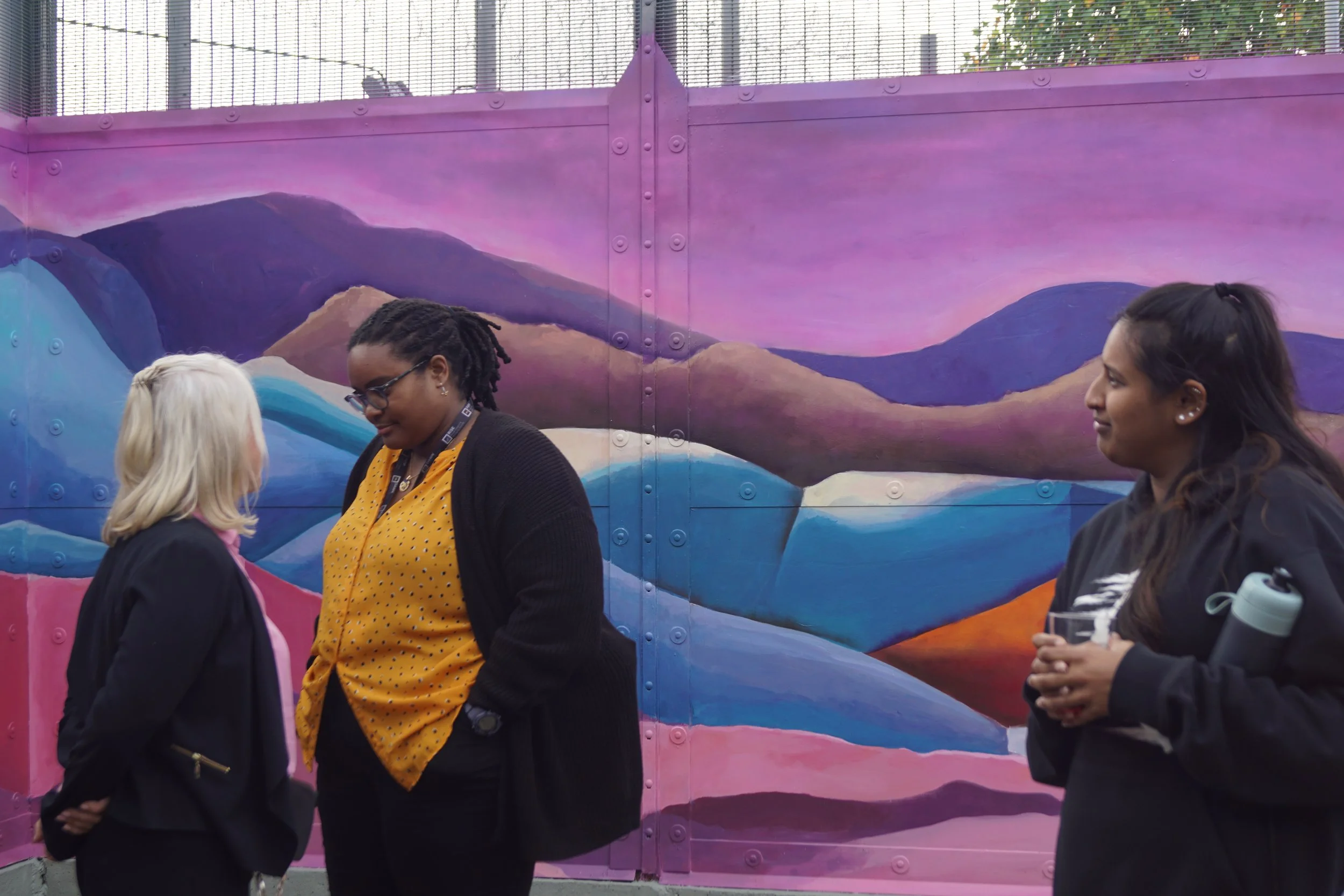
The layers of colour bring a new depth to the space, breaking up the blankness of the wall and minimising the harshness of the surrounding colour palette.
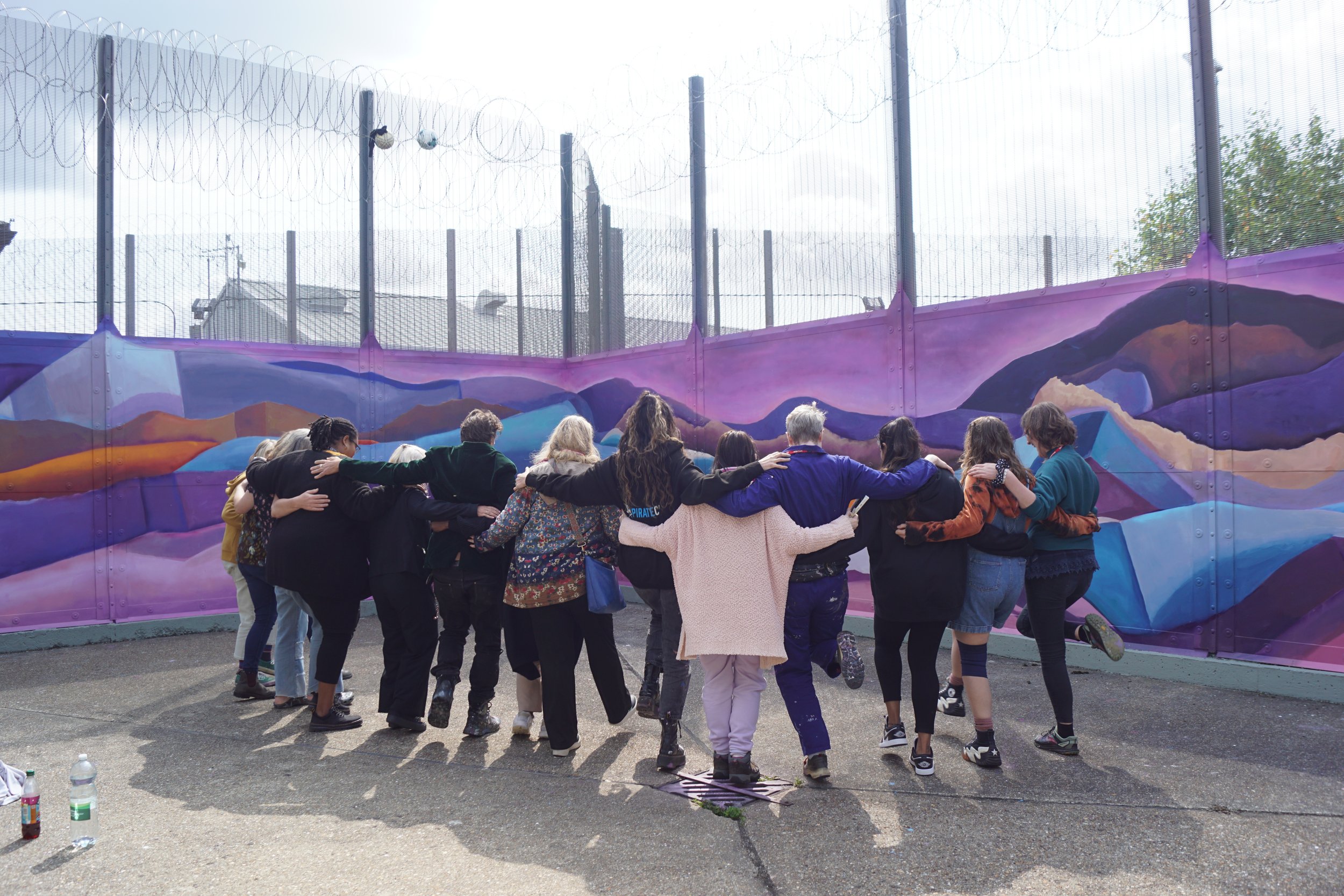
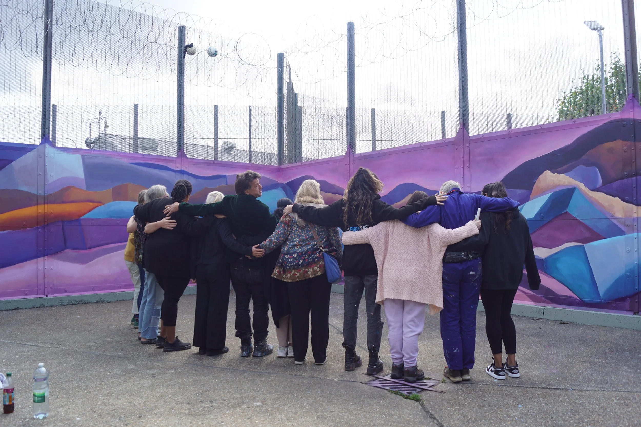
It took our team of 6 students and lead artist Patricio, 7 painting days (with a weekend break) to finish the mural. The mural was partly funded by the Arts Council and Clean Break, enabling us to offer half of the painting spaces on this project to Clean Break scholarship students.
As expected, working within the prison was unpredictable but hugely rewarding. Below are some reflections from Cohort 5 students involved in the project:
“When I first went into the yard it has a military, oppressive and heavy feel. The last
time I saw the space I had forgotten we were in a prison yard.”
“We fashioned a paint moving system from crates and a scavenged trolley, which definitely helped, as we had to carry everything through about 9 gates, all of which need opening then locking behind us before we are allowed to proceed to the next one.”
“[one of the women in custody] who’s working with us says she was really moved to see the image design and spent a while
looking at the photocopy. She says it’s the most enjoyable experience she’s had in her 13 months here”
“I learned about the power of art through this process, how meaningful and impactful art can be. In this
case we painted a space that was heavily oppressive and made it feel light again.”
There are many ways to interpret the design; stacks of paper, meeting horizons, even as unfurling layers of time. A flowing confluence of lightness into dark.
The colours are important, “heavenly” as one resident put it. Deep, moody purples with glimmers of white, blue and just a touch of orange to bring some edge.
It is a design that doesn’t shout out a particular message, but perhaps speaks its meaning to each one of its viewers individually, quietly.
All participants from LSOM and the prison expressed how positively eye-opening, and unexpected this project felt.
This full impact of this mural will hopefully be felt slowly and steadily, over many years to come.